Piet Boon

industrial presentation by .PSLAB lighting fixtures at conceptstore Graanmarkt13 Antwerpen

PSLAB graanmarkt 13 Antwerpen Concept Store industrial presentation by .PSLAB lighting at conceptstore graanmarkt 13 Antwerpen
scroll naar beneden voor NL
PSLAB at Graanmarkt 13 Antwerpen Concept Store | by C-More

Industrial presentation by 

.PSLAB lighting 

at conceptstore Graanmarkt 13 

Antwerpen


Being invited for the brunch at Conceptstore Graanmarkt 13 Antwerpen 

by .PSLAB was one of the highlights of 2014! 

.PSLAB is located in Beirut, Lebanon.
They design and manufacture context specifically for projects and also for residential interiors.
.PSLAB received several design awards. As they say themselves: 

“We are mostly known for our lighting services – our international projects include custom-made technical and
sculptural lighting objects in collaboration with renowned architects and designers. For each project, we make
specific objects for specific contexts. While our practice has mainly coalesced around lighting services,.PSLAB
continues to expand its repertoire to include a wide variety of design projects.”

.PSLAB designed all the lamps for Graanmarkt 13.
You might know them from the big big chandelier they made for The Jane a restaurant
by Sergio Herman and interior by Piet Boon and Studio Job.
See this blogpost for more inspiration and information about The Jane Antwerpen. 
While.PSLAB designed the light fixtures for the conceptstore,
the interior design is done by Vincent van Duysen, which is also one of my favourite designers. 
.PSLAB took us for a tour throughout the building.
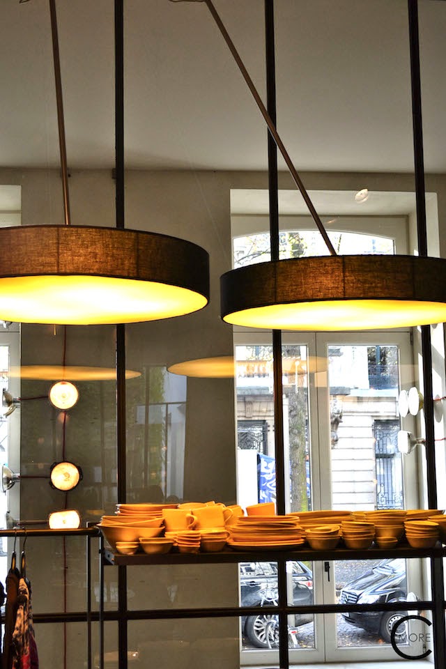
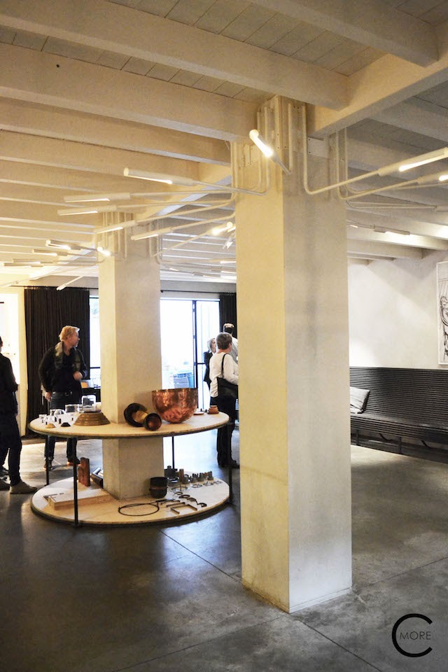
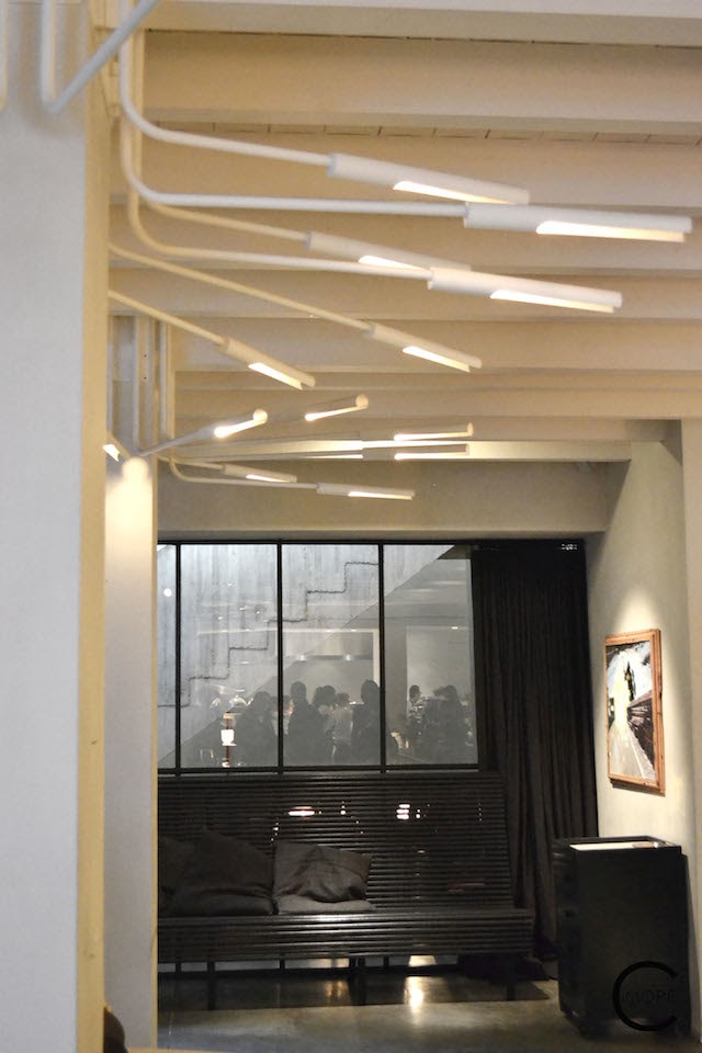
All the lighting is especially designed and made for this whole building.
In the shop they showed us the lamps used on the walls, ceiling and pillars.
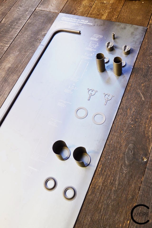
But also, for this occasion, there was a very minimalistic and industrial presentation:
PSLAB unassembled the parts of the lamps and put them in order on a steel plate,
together with the drawings.  I loved this way of presentation. 
Most of the lights are tubular shaped. Except the genuine old car lights on the wall. 
These unique lamps I like the most. 
Graanmarkt 13 is one of my favourite stores in Antwerpen.
I always go there when I visit the city.
I love the designs by .PSLAB and Vincent van Duysen
so this was a great opportunity for me to meet and greet them in person.
There is also a high-end restaurant by Seppe Nobels in the basement
and a very very nice apartment which you can rent, above the store.
I made some very nice pictures there too, so stay tuned for that blogpost! 
Enjoy!

PSLAB at Graanmarkt 13 Antwerpen Concept Store | by C-More


Industriële presentatie van
.PSLAB verlichting
bij conceptstore Graanmarkt 13
Antwerpen


Uitgenodigd worden voor de brunch in Conceptstore Graanmarkt 13 Antwerpen door .PSLAB was een van de hoogtepunten van 2014!


.PSLAB is een ontwerp bureau gevestigd in Beiroet, Libanon. 
Zij ontwerpen en produceren context specifiek voor projecten maar ook voor privé huizen. 
.PSLAB ontving verschillende design awards. 


Zoals ze zelf zeggen:

“We zijn vooral bekend om onze verlichting diensten – onze internationale projecten zijn op maat gemaakte technische en sculpturale verlichting objecten in samenwerking met gerenommeerde architecten en ontwerpers. Voor elk project maken we specifieke objecten voor specifieke contexten. Onze diensten als bureau concentreren zich nu voornamelijk rond verlichting, maar .PSLAB blijft zijn repertoire uitbreiden naar een breed scala van ontwerp en projecten. “


.PSLAB ontwierp alle lampen voor Graanmarkt 13. 
Je kent ze misschien van de bijzondere en grote kroonluchter die ze maakten voor The Jane, een restaurant van Sergio Herman en interieur van Piet Boon en Studio Job. 
Zie deze blogpost voor meer inspiratie en informatie over The Jane Antwerpen.


.PSLAB ontwierp de lampen voor de conceptstore, het interieur werd ontworpen 
door Vincent Van Duysen, die ook een van mijn favoriete ontwerpers is.


.PSLAB nam ons mee voor een rondleiding door het gebouw. 
Alle verlichting is speciaal ontworpen en gemaakt voor dit hele gebouw. 
In de winkel lieten ze ons de toegepaste lampen op de muren, het plafond en pilaren zien. 
Maar ook was er, speciaal voor deze gelegenheid, 
een zeer minimalistisch en industriële presentatie: 
.PSLAB demonteerde de delen van de lampen en zette ze in volgorde op een stalen plaat, 
samen met de industrieel technische tekeningen. Ik hou wel van deze manier van presenteren.


De meeste lampen zijn buisvormig. Behalve de oude auto verlichting op de muur.
Dit vind ik de mooiste lampen van dit project!


Graanmarkt 13 is een van mijn favoriete winkels in Antwerpen. 
Ik ga er altijd heen wanneer ik een bezoekje aan de stad breng. 
Daarnaast waardeer ik de ontwerpen van .PSLAB en Vincent van Duysen enorm, zij zijn een gewaardeerde inspiratiebron voor mij.
Dus dit was een geweldige kans om hen allemaal persoonlijk te ontmoeten.

Ps: Er is ook een high-end restaurant van chefkok Seppe Nobels in de kelder 
en een heel erg mooi appartement dat je kunt huren, boven de winkel. 
Ik heb er een aantal hele mooie foto’s gemaakt, dus: 
Blijf nog even rondhangen hier voor die blogpost!


Geniet! 


++++++++++++++++++++++

Like more of this? 
Then follow me and stay updated :-)
And feel free to respond here on my blog!

I’d like to here from you…

Link with love 
Xo Iris
++++++++++++++++++++++

NLXL wallpaper | Studio Job | wins at ICFF New York

Dutch wallpaper Design brand NLXL and Studio Job win at ICFF the best wall covering price.

scroll naar beneden voor NL

NLXL Archives by Studio Job” collection | Milan 2014 by C-More

What a great compliment for Dutch Wallpaper Brand NLXL
and Dutch Designers/ Artists Studio Job to win the best wall covering award
2014 at ICFF for the “ Archives by Studio Job” collection.
NLXL Founder Rick Vintage
says “For a small Dutch company to win the award
twice is just outrageous. We basically try to make striking products and
have a lot of fun. Winning this award emphasizes that putting fun first simply
works. Off course all credit goes to Job Smeets and Nynke Tynagel of Studio
Job. This one is for their incredible talent!”
 
The ”Archives by Studio Job” collection was on display
at ICFF and in all 6 windows of the Alexander McQueen presentation at Saks Fifth Avenue NYC.
I saw the collection for the first time when I visited
Zona Tortona during the Design Week in Milan last April.[see pictures below] 
But of course I know
NLXL for a long time from their scrap-wood wallpaper with Piet Hein Eek [which
they won also an ICFF price with!], the Brooklyn Tins wallpaper with Merci
Paris and the concrete wallpaper with Piet Boon. And I know Studio Job too.
I’ve even had an interview lunch with Studio Job last October. So I was thrilled to see the new collection.
The collection is called Archives because NLXL literally
dived in the archives of Studio Job. Job Smeets and Nynke Tynagel are well
known for their archetypical drawings. They put these universal symbols
together in an iconographic pattern and composition. 
The original patterns were
created for other design projects, fashion shows of Viktor & Rolf, or their
own artwork. This series of 7 new wallpaper designs is a reinterpretation of
them.  
And as Job Smeeds says: “However,
I don’t expect that aesthetes will paste them side by side in this way. This is
wallpaper for advanced decorators; you can use these patterns to create your
own conceptual wall. This is not standard wallpaper. These are 9-metre-long
compositions.”  
When I visited the booth of NLXL at IFCC I asked how
the people in NYC reacted to this new collection. “ They love it” was the
answer. And I can fully understand why. We, over here in the Netherlands where
I live, don’t
use that much wallpaper anymore since the 70s and almost all houses have white
walls, due to designer Jan Des Bouvrie and the “ Goed Wonen” movement. In contrast to the Americans who do use more decorative wallpaper.So I immediately can see why this can be a great success.  I wonder if this new Wallpaper makes a chance for the Netherlands too….
 And what a great way to
make a personal statement, with this wallpaper. 
Job smeets says it like this: The end result is not a
neutral, objective picture like you can create with traditional wallpaper. If
you cover your wall with this wallpaper, you really bring something home. This
goes beyond styling. “But where do you hang your paintings?”, I hear someone grumble.
My reply: The plain white wall behind a painting is an idea from modernism. In
the seventeenth and eighteenth centuries, it was not uncommon to display
paintings on silk wallpaper with very busy patterns. But let me put it another
way: with this wallpaper you no longer need any paintings. Viewed in this way –
per running meter – it is relatively cheap art.’
And so it is.   
The Archives Wallpaper is available in 7 patterns with
no repeat: Industry, Labyrinth,
Perished, Alt Deutsch, l’Afrique and Withered Flowers, black & white
and Withered Flowers in color.
Enjoy!!   

NLXL Archives by Studio Job” collection | Milan 2014 by C-More

NLXL Archives by Studio Job” collection | Milan 2014 by C-More

NLXL Archives by Studio Job” collection | Milan 2014 by C-More


NLXL Archives by Studio Job” collection | Milan 2014 by C-More

NLXL Archives by Studio Job” collection | NYC 5th Avenue Alexander McQueen presentation at Saks  2014 by C-More

NLXL Archives by Studio Job” collection | NYC 5th Avenue Alexander McQueen presentation at Saks  2014 by C-More

NLXL Archives by Studio Job” collection | NYC 5th Avenue Alexander McQueen presentation at Saks  2014 by C-More

NLXL Archives by Studio Job” collection | NYC 5th Avenue Alexander McQueen presentation at Saks  2014 by C-More


 NLXL en Studio Job winnen bij ICFF 

de beste behang | wandbekleding award. 


Wat een groot compliment voor het Nederlandse Behang merk NLXL en de ontwerpers / kunstenaars Studio Job! 
Zij wonnen ” the best wall covering award 2014 bij ICFF in New York afgelopen mei.
NLXL Oprichter Rick Vintage zegt: “Het is voor een klein Nederlands bedrijf waanzinnig om twee twee de award te winnen!  We proberen opvallende producten te maken en hebben daar veel plezier in. Het winnen van deze award onderstreept plezier maken gewoon werkt. Natuurlijk gaat alle eer naar Job Smeets en Nynke Tynagel van Studio Job. Dat is voor hun ongelooflijke talent! “
De “Archives door Studio Job” collectie werd tentoongesteld in ICFF NY en in alle 6 de etalageramen van de Alexander McQueen bij Saks Fifth Avenue NYC. 
Ik zag de collectie voor de eerste keer toen ik Zona Tortona tijdens de Design Week in Milaan bezocht, afgelopen april.[zie foto’s hierboven] Maar natuurlijk ken ik NLXL al een lange tijd door de afval-hout behangcollectie met Piet Hein Eek (waarmee ze eerder een ICFF award me wonnen!), De Brooklyn Tins behangcollectie in samenwerking met Merci Parijs en natuurlijk het beton behang met Piet Boon. En ik ken Studio Job ook. Ik heb zelfs een lunch-interview met ze gehouden vorig jaar oktober. Dus ik was blij om de nieuwe collectie te zien. 
De collectie heet Archives want NLXL is letterlijk de archieven van Studio Job ingedoken.  Job Smeets en Nynke Tynagel staan ​​bekend om hun archetypische tekeningen. Ze verwerken deze universele symbolen samen in een iconografisch patroon. De originele patronen zijn eerder speciaal gemaakt voor diverse andere design projecten, zoals de modeshows van Viktor & Rolf, of komen uit kunstwerk. 

Deze serie van 7 nieuwe behang dessins zijn een herinterpretatie van deze patronen. Job Smeeds zegt: “Maar ik verwacht niet dat estheten het gewoon naast elkaar op de wand plakken.
Dit is behang voor gevorderde decorateurs: je kunt deze patronen gebruiken om een eigen conceptuele muur te creëren. Dit is niet het standaard behang.  Dit zijn 9 meter lange composities.”
Toen ik bij de stand van NLXL op IFCC New York was ik vroeg hoe de mensen in NYC gereageerd op deze nieuwe collectie. “Ze vinden het fantastisch , was het antwoord. En ik kan volledig begrijpen waarom. 

Hier in Nederland, gebruiken we, in tegenstelling tot de Amerikanen, sinds de jaren ’70 niet veel behang meer 

en bijna alle huizen hebben witte muren, als gevolg de nieuwe stroming in het interieur door oa ontwerper Jan des Bouvrie en de “Goed Wonen “beweging. In America wordt wel veel decoratief behang toegepast. Ik geloof direct dat dit een groot succes kan worden. Ik ben benieuwd of dit 


nieuwe behang ook weer een opleving van gedecoreerde wanden in Nederland gaat betekenen…

Job Smeets zegt het als volgt: “Het eindresultaat is niet een neutraal, objectief beeld zoals je krijgt bij  traditioneel behang. Als je dit behang toepast dan heb je echt iets in huis. Dit gaat verder dan styling. “Maar waar moet je je schilderijen ophangen?” Hoor al ik iemand mopperen. Mijn antwoord: De gewone witte muur achter een schilderij is een idee van het modernisme. In de zeventiende en achttiende eeuw, was het niet ongewoon om schilderijen op zijde behang met met zeer drukke patronen te plaatsen. Maar laat ik het anders zeggen: met dit behang heb je geen schilderijen meer nodig…… En als je het zo bekijkt is het – per strekkende meter –  relatief goedkope kunst!”

En zo is het. 

Het Archief Wallpaper is verkrijgbaar in 7 patronen zonder herhaling: 
 Industry, Labyrinth, Perished, Alt Deutsch, l’Afrique and Withered Flowers, black & white en Withered Flowers in color. 


++++++++++++++++++++++
Like more of this? 
Then follow me and stay updated :-)
And feel free to respond here on my blog!

I’d like to here from you…

Link with love 
Xo Iris
++++++++++++++++++++++


Huys Piet Boon | New York City | By C-more

Huys

Piet Boon New York City
” A Dutch Light Shines over Manhattan”

Scroll naar beneden voor NL
Huys by Piet Boon | New York City | by C-More

While I was in New York for BlogtourNYC

I hoped to get the opportunity to visit

Huys by Piet Boon at 404 Park Avenue.
And boy was I lucky: I did!

This 1917 neoclassic building is totally renovated by the award-winning Dutch property developers Kroonenberg Groep and Piet Boon created the total concept for it. The commercial offices are transformed in 58 luxurious condominiums and a ground-floor retail space.


When I entered the apartment for the private tour, I immediately felt so much at home. The clean lines and open floorpan, the use of natural materials like the light oak floors, the calm color scheme all in whites, naturals and greyish tones, with some accent colors in the artwork and styling and of course the furniture in the modern style, with the ferm lines, all made me feel instantly relaxed, but still so right in the middle of the Big Apple!

Of course I felt this way because I know Piet Boons style so well, and you can say I’m a fan of his work, but also because you can feel the ancient connection between New York and The Netherlands. It’s like this place and everything in it belongs here, it always supposed to be here. It all comes together in this building.

All the items, the apartments and the whole building are finished with the most loveliest and luxurious materials and designs with an eye for details. It feels very elegant and stylish, but with the down to earth touch of the Dutch Design mentality. A kind of less is more, but with a little extra. The building also has a big Roof terrace garden, a media lounge, a children’s playroom and a fitness space. Of course there is a doorman and a concierge.

Next to the condominiums there are also the penthouses with private loggia and view over the Manhattan skyline and a gas fireplace by Piet Boon. That’s the kind of penthouse I live in in my biggest dreams! So now I’ll take you with me on the tour of one of the condominiums.  Hope you just like it as much as I do ….

I’m going to take a nap now and dream on…


More Piet Boon at my blog:

Piet Boon Kitchen 

Piet Boon Milan Salone del Mobile 2015

Piet Boon | Serax 

Piet Boon | Marriott Hotel Amsterdam


More info: Piet Boon Huys and Huys NYC
Enjoy!
Huys by Piet Boon | New York City | by C-More

If you see here below the READ MORE button: Please CLICK the button for more pictures and the DUTCH version!!

THX and Enjoy!!

Als je hieronder de READ MORE button ziet: klik daar op en scroll naar beneden voor meer foto’s en de Nederlandse tekst.

Veel plezier!

Read More

Piet Boon at Zona Tortona with Linteloo | Milan | Salone del Mobile 2014

Piet Boon at Zona Tortona with Linteloo 

Milan | Salone del Mobile 2014

Scroll naar beneden voor Nederlands
You probably have heard it already: The collaboration between Piet Boon and Linteloo. Linteloo now covers the production, sales and distribution of the Piet Boon Collection, but Piet Boon will continue to do the designing and development at his studio. During the Salone del Mobile 2014 they presented both collections in a wonderful location at Via Tortona.
What surprised me was the colorful presentation. Piet Boon is well known for his neutral and calm color palette, but this time it was very vivid! The settings were mostly in greens with almost yellowish greens, or grays with dusky pink, in daring, but not too bold combinations. I liked it a lot! And the fine fabrics like velvets and smooth leathers…A very comfortable feeling :-)
Enjoy! 
Piet Boon furniture Collection at Via Tortona | Salone del Mobile 2014 | C-More

Piet Boon furniture Collection at Via Tortona | Salone del Mobile 2014 | C-More

Piet Boon furniture Collection at Via Tortona | Salone del Mobile 2014 | C-More

Piet Boon furniture Collection at Via Tortona | Salone del Mobile 2014 | C-More

Piet Boon furniture Collection at Via Tortona | Salone del Mobile 2014 | C-More
Piet Boon styling at Via Tortona | Salone del Mobile 2014 | C-More

Piet Boon styling  at Via Tortona | Salone del Mobile 2014 | C-More

Piet Boon at Zona Tortona with Linteloo 

Milan | Salone del Mobile 2014


Je hebt waarschijnlijk al wel gehoord: De samenwerking tussen Piet Boon en Linteloo. 
Linteloo regelt nu de productie, verkoop en distributie van de Piet Boon collectie, maar Piet Boon  studio zal zelf de ontwerpen en ontwikkelen van de collectie blijven doen. Tijdens de Salone del Mobile 2014 waren beide collecties te zien op een prachtige locatie aan de Via Tortona. 


Wat me aangenaam verraste was de kleurrijke presentatie. Piet Boon staat bekend om zijn neutrale en rustige kleurenpalet, maar deze keer was het erg levendig! De settings waren vooral in groentinten met bijna geelachtig groen of in grijs met oudroze. Gedurfde, maar niet te pittige combinaties. Ik vond het erg mooi! En de fijne stoffen zoals fluweel en soepele leersoorten … Die geven het geheel een super comfortabel gevoel :-)


Enjoy!


++++++++++++++++++++++
Like more of this? 
Then follow me and stay updated :-)
Link with love 
Xo Iris
++++++++++++++++++++++


New restaurant The Jane Antwerpen by Piet Boon®, Sergio Herman and Nick Bril

Wat is het mooi geworden! 
I Love it!
New restaurant The Jane Antwerpen 
by Piet Boon®, Sergio Herman and Nick Bril
scoll down for english

The Jane by Piet Boon®

“GODDELIJK’ FINE DINING EXPERIENCE THE JANE OPENT HAAR DEUREN OP 25 MAART

Michelin-sterrenchef Sergio Herman en chef-kok Nick Bril creëerden ruim drie jaar geleden hun “fine dining meets rock ’n roll” restaurantvisie samen met ontwerper Piet Boon op een mystieke plek in Antwerpen; de kapel van een voormalig militair hospitaal.”
Zo begon het persbericht dat ik van Piet Boon ontving.
Ik had er natuurlijk al veel over gehoord en zat op het puntje van mijn stoel om het eerste nieuws te mogen ontvangen: hoe zal het er gaan uitzien? Wat zijn de plannen? Welke stijl gaat het worden? En dan natuurlijk het eten: de gerechten van Sergio Herman…. 
Dat kan alleen maar top worden!
En het wordt alleen maar beter:
Piet Boon Studio heeft er voor gekozen om het karakteristieke pand, dat een kapel van een voormalig militair hospitaal is, grotendeels in zijn waarde te laten door bijvoorbeeld het originele plafond in zijn authentieke staat te laten. 
Pure Wabi Sabi als je het mij vraagt!
De door glas omhulde keuken staat op de plek van het vroegere altaar:  Het hart van het gebouw. 
Je ziet dus letterlijk wat de koks voor jou aan het bereiden zijn. 
Verder zijn er in het gebouw, zoals Piet Boon in zijn interieurs en Sergio Herman samen met Nick Bril in de gerechten toepassen, veel pure en rijke materialen gebruikt zoals natuursteen, eikenhout en leer.
Spraakmakende samenwerkingen zijn er aangegaan met bijvoorbeeld Studio Job [die ik onlangs geïnterviewd heb] voor de bijzondere ramen en de enorme kroonluchter van 12 bij 9 meter door PSLAB. Zie onderaan de video van de lamp “ Making of ‘Lion Fish‘” 
Het servies BASE dat Piet Boon ontwierp is in samenwerking met Serax uitgebracht en zal voor het eerst in The Jane gebruikt worden.
 Binnenkort ga ik weer  naar Antwerpen en ga er dan ook vast en zeker voor zorgen dat ik een hapje ga eten bij The Jane, waarvan natuurlijk uitgebreid verslag volgt hier op mijn blog….
The Jane is vanaf nu geopend voor publiek, dus als je zelf een kijkje wilt gaan nemen, ga dan naar de website The Jane en reserveer!
Wordt vervolgd! 
The Jane by Piet Boon®

The Jane by Piet Boon®

The Jane by Piet Boon®

The Jane by Piet Boon®

” DIVINE FINE DINING EXPERIENCE THE JANE OPENS ITS DOORS ON 25 MARCH 

Michelin starred chef Sergio Herman and chef cook Nick Bril created more than three years ago, their “fine dining meets rock ’n roll” restaurant vision along with designer Piet Boon in a mystical place in Antwerp , the chapel of a former military hospital. “


Thus began the press release that I received from Piet Boon.

I heard a lot about The Jane and sat on the edge of my seat to receive the first news: How will it be? What are the plans? What style will it be? And then of course the food, the courts of Sergio Herman …. That can only be top!

And it only gets better: Piet Boon Studio has decided to restore only the necessary parts and to conserve the rest of the characteristic chapel of the former military hospital. For example: the original ceiling is mostly left in its authentic state.
Pure Wabi Sabi if you ask me!

The glass walled kitchen is situated in place of the former altar: the heart of the building.
So you literally see what the cooks are preparing for you.

Piet Boon, Sergio Herman and Nick Bril all love to work with pure and rich ingredients and so they applied natural stone, oak and leather in the building, to complete the concept.

Also some high-profile collaborations are entered, for example, Studio Job [ Whom I recently interviewed] for the special windows and PSLAB for the huge chandelier which is 12 by 9 meters big! 
See also the video  below of the making of the lamp : 
 “ Making of ‘Lion Fish‘”

The tableware BASE by Piet Boon is released in cooperation with Serax and will be used for the first time at The Jane.

 I regularly go to Antwerp and will certainly make sure that I ‘m going to visit and grab a bite at The Jane, and of course make a full report, over here at my blog ….

The Jane is now open to the public, so if you want to take a look for yourself, and be pampered with delicious food and immersed in luxury: go to the website  of  The Jane and book a nice place !

To be continued !

The Jane by Piet Boon®

Video van het maken van de lamp “ Making of ‘Lion Fish‘”
The video of the making of the lamp  Making of ‘Lion Fish‘”

More info:  The Jane Antwerpen


++++++++++++++++++++++
Like more of this? 
Then follow me and stay updated :-)
Link with love 
Xo Iris
++++++++++++++++++++++
Related Posts Plugin for WordPress, Blogger...

All rights reserved © Copyright 2007-2015 by C-More Interior blog · Theme by Blogmilk + Coded by Brandi Bernoskie