Hi!
A while ago I moved my blog from Blogger to WordPress. And since I’m blogging from 2007, there are a lot of blogposts to check… So if you see a blogpost that’s missing photo’s or has a weird layout, please let me know by leaving a comment at that particular blogpost. In the meantime I’m walking through all my posts myself too.
I hope you like my new layout! Thanks for visiting.
See you around!
XO Iris
Hi!
Ik heb mijn blog van Blogger naar WordPress verhuisd! En aangezien ik sinds 2007 blog, zijn er een heleboel blogposts te controleren … Dus: zie je een blogpost waarbij foto’s ontbreken of die een rare lay-out heeft, laat het me weten dmv het plaatsen van een reactie op die blogpost. In de tussentijd loop ik al mijn berichten zelf ook nog na.
Ik hoop dat mijn nieuwe layout bevalt!
Bedankt voor je bezoekje, zie je later!
XO Iris
The use of images and text from this blog.
The use of images and text from this blog.
Want to use a post, photos or text of my blog? Great! Please always mention my full blog name and a correct link to the origin of the article on my blog on: your blog, pinterest boards, instagram, tumbler, your site or wherever you want to use my content. And... Please give me a note if you have it published!
Also make sure that all the images have the original source / photographer named. For pictures that are not mine, please contact the owner by yourself to ask permission...
As for the posts on my blog: I try my best to mention all the names and links correct and ask permission in advance. If you spot an item here on my blog that belongs to you and I do not have the accurate information, please contact me, I'll adjust it asap.
Thank you! XO Iris | C-More
Gebruik van beeldmateriaal en tekst van deze blog.
Wil je een post, foto's of teksten van mijn blog gebruiken? Leuk! Plaats dan in ieder geval mijn blognaam en een link naar de oorsprong van het betreffende artikel op mijn blog op: jouw blog, pinterest boards, instagram, tumbler, je website of waar je het ook publiceert. Geef je mij een berichtje als je het geplaatsthebt?
Zorg ook dat bij alle afbeeldingen de originele bron / fotograaf komt te staan.
Wat betreft de posts op mijn blog: ik doe mijn best alle namen en linkjes goed te vermelden. Mocht je iets tegenkomen wat jou toebehoort en ik er geen juiste informatie bij hebben staan, neem dan contact met me op, dan pas ik het direct aan.
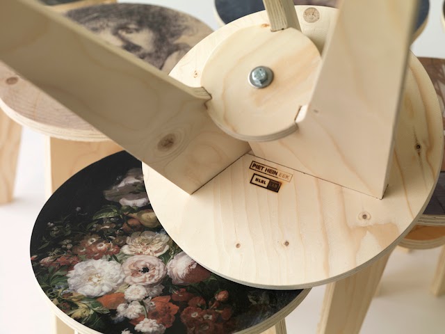
Who could have dreamed that two of my great inspiration themes that are so far apart, could combine so well together. As you know I love the paintings by Vermeer and other Dutch masters. I also am very fond of Dutch Design and one of my favourite designers is Piet Hein Eek. He designs furniture and interior accessoires from a very personal perspective. If you are in The Netherlands you really should go and visit Piet Hein Eek’s shop and workplace in Eindhoven.
Last DDW14 I was invited by NLXL [ very well known by the Piet Hein Eek scrap wood wallpaper, the Studio Job wallpaper and the Merci Brooklyn tiles wallpaper] and Piet Hein Eek at their party. I met some great friend and people I hadn’t seen for a long long time! It was a great evening. It was also the launch of some new products design by Piet Hein Eek.
Like the Plywood Print Stool.
Can you imagine I fell in love with it immediately?
Wie had kunnen dromen dat twee van mijn grote inspiratie thema’s die zo ver uit elkaar liggen, toch zo goed combineren. Ik hou van de schilderijen van Vermeer en andere Nederlandse Meesters. Ik ben ook dol op Dutch Design en een van mijn favoriete ontwerpers is Piet Hein Eek. Hij ontwerpt meubels en interieur accessoires vanuit een heel persoonlijk perspectief. Als je in Nederland bent moet je echt Piet Hein Eek’s winkel en werkplaats in Eindhoven bezoeken.
Laatst tijdens DDW14 was ik uitgenodigd door NLXL [bekend van het Piet Hein Eek sloophout behang, het Studio Job behang en de Merci Brooklyn tiles wallpaper] en Piet Hein Eek bij hun feestje. Ik ontmoette een aantal fijne vrienden en mensen die ik al heel lang niet had gezien! Het was een gezellige avond. Het was ook de lancering van een aantal nieuwe producten ontworpen door Piet Hein Eek.
Een daarvan is de Plywood Print Stool.
Kun je je voorstellen dat ik daar gelijk verliefd op werd?
Pat het niet perfect bij mijn Design -passie in alle vormen?
Het zou een perfecte krukje voor in mijn huis zijn.
Het is waar de Nederlandse meesters Nederlands Design ontmoet.
Er zijn 10 verschillende designs, van Rembrandt tot Vermeer.
De prijs is € 169, –
[of US $ 219 | UK £ 169 | RIJ US $ 219]
En met deze kruk heb je een origineel Dutch Design stuk , ontworpen door Piet Hein Eek [met dank aan het Rijksmuseum Amsterdam een echt kunstwerk van de Dutch Masters[met dank aan het Rijksmuseum Amsterdam] in huis!
Dutch Design | Frederik Roijé for Rijksmuseum| SHADES OF PLATES
Frederik Roijé has designed a few items for the Dutch Rijksmuseum. He and his studio are masters in minimal and industrial design. All designs they make are brought back to clear lines and pure materials. Decoration and patterns are fine and plain.
Esmay Gunter, International Lifestyle Studies Student at Fontys in Tilburg with subject of study trend watching and concept, visited the Dutch Design Week in Eindhoven together with me. In the line of her study, she wrote a trend report in the form of a blog post. Very interesting to read her findings!
Enjoy!
Dutch Design Week & Trends by Esmay Gunter
Just like any other year, the Dutch Design Week took place at Eindhoven from October 7 till October 28. Being an International Lifestyle student, I went to the fair searching for signals and trends that stood out in the world of design.
DDW15 Trend – Let It Be – | “Cosmetic Surgery” by Bora Hong | “Gewildgroei” by Benny Meek | Table by Yolanda Heintze | Pictures by Esmay Gunter
– Let It Be –
The first trend I spotted was the opposite of what the beauty standard is today. these days, everything has to be perfect and everything your body does naturally is being pushed back to maintain this image of perfection. The opposite reaction on this beauty standard shows us that we don’t need to hunt for perfection and just let our body go his way.
A perfect example is cosmetic surgery, something that becomes more and more the standard for people these days.
Designer Bora Hong questions the meaning of beauty and design trends by comparing them with the development in the design branch. Just like a cosmetic surgeon, Bora Hong transforms old second-hand chairs in to iconic design masterpieces, such as the LCW chair of Eames. by doing so she tries to show people that changing someone’s body, or in this case, a chair goes against the way you really are.
Another signal that follows this trend is ’’Gewildgroei’’, a project by Benny Meek. Instead of working against nature, he wants to work together with nature. He thinks that this is something crucial that has to change in the way we look at ourselves. weeds are seen as something unwanted. That’s why Benny Meek designed a tile where ”Gewildgroei”, the counterpart of weeds, are allowed to grow as they like. This way nature can go her way without being stopped. This also creates more real nature in cities which helps adding to a healthy environment.
Yolanda Heintze has designed a table in which this trend has been taken very literally. Nature grows right thru the table, making it look like nature was just left there like it was.
——————–
DDW15 Trend – Fit in – | “Current Window” by Marjan van Aubel | 3D Printed canal house by DUS architects | lamp ” ZUID” by Francoise Oostwegel | Pictures by Esmay Gunter
– Fit in –
Due to recent demographic changes and technological advancement it sometimes seems that cultures slowly fade away. But something like culture is really important, it is part of someone’s identity. I spotted multiple signals that try to maintain culture, but at the same time trying to fit this culture in to modern day designs. This creates new ways to implement your own culture.
An example of this signal is “Current Window” by Marjan van Aubel. It is a modern day version of stained glass windows created with modern day instruments. The colored glass extracts electricity out of daylight which can be used to power your electronic devices inside your house. This way you can even charge your phone whilst sitting next to your window by having it plugged in the implemented USB-ports in your window sills. This creates an old cultural aspect like stained glass, into something modern and innovative.
Another signal of this trend is the 3D Print Canal House, a 3D printed canal house located in Amsterdam-Noord. It is a project by DUS Architects and Partners. This makes for a whole new way of building the iconic canal houses by using the latest innovative technology, and still maintaining the cultural aspect of the houses.
Lamp ,ZUID’, designed by Francoise Oostwegel, is another signal that fits the trend. She used the cultural heritage of Limburg to design this creation, such as the mining area and the traditional craftsmanship houses. This makes ,ZUID’ not only a lamp, but it also tells the story of our most southern province.
——————–
DDW15 trend – Sense Intense – | Clock “O” by Wout Wolf Stroucken | “Solid Vibrations” by Ricky van Broekhoven and Olivier van Herpt | “Ripening Rugs” by Adrianus Kundert van Nieuwkoop | Pictures and trend report By Esmay Gunter
– Sense Intense –
Everything has to be quick these days. Every second counts and we barely have any time to stop and think about something or to think about things that have happened before. It creates a feeling of time just flying by. This creates a desire to intensify the present, and to relive certain memories to feel this intense feeling once more. I have spotted certain signals that go further than anything else before, and that try to give you an intense feeling.
Wout Wolf Stroucken designed a clock named “O”. The clock has no numbers, nor an indicator. The time is indicated by colors. Just like a tree’s growing rings, the clock shows the time using the rings that grow from the center of the clock towards the border. This makes people able to focus more on the now and here, rather than worrying about the future.
Another interesting design that plays with intensive feelings is “Solid Vibrations”. Ricky van Broekhoven and Olivier van Herpt build a 3D printer for ceramic designs. It allows them to interfere with the printing process by using vibrations caused by sounds. This makes it possible to transform music into something you can touch because it’s printed on something solid. It happens a lot that a certain song makes people remember certain things like a nice summer holiday. That specific song can now be transformed into something solid, something that you can actually hold and touch. This makes the memory more intense because not only can you hear the song, now you can even touch it.
And last, Adrianus Kundert van Nieuwkoop designed “Ripening Rugs”. These are carpets that show a positive effect when they are used much. The carpets actually ‘come to life’ when they are used intensively. They change color, patron or even texture.
Trends gespot
tijdens de
Dutch Design Week | DDW15
door Esmay Gunter
Esmay Gunter, Student International Lifestyle Studies op het Fontys in Tilburg, met als richting trendwatching en conceptontwikkeling heeft samen met mij de Dutch Design Week in Eindhoven bezocht. In het kader van haar studie heeft zij een trendreport in de vorm van een blogpost gemaakt. Zeer interessant om haar bevindingen te lezen.
Geniet!
——————–
Dutch Design Week & Trends door Esmay Gunter.
Ook dit jaar vond de Dutch Design Week plaats in Eindhoven, van 17 t/m 25 oktober. Als International Lifestyle Student ging ik naar de beurs op zoek naar opvallende signalen en trends in de wereld van design.
——————–
– Let It Be –
De eerste trend die ik gespot heb is een tegenreactie op ons schoonheidsideaal. Tegenwoordig moet alles maar perfect zijn en worden natuurlijke omstandigheden of veranderingen tegengegaan. De tegenreactie hierop laat zien dat we juist niet moeten streven naar perfectie en de natuur niet moeten tegenwerken.
Een voorbeeld hiervan is bijvoorbeeld de cosmetische chirurgie, wat vandaag de dag steeds normaler lijkt te worden.
Designer Bora Hong bevraagt de betekenis van schoonheids- en design-trends door cosmetische chirurgie te vergelijken met ontwikkelingen in het designveld. Als een plastisch chirurg bouwt Bora Hong tweedehands stoelen om naar iconische ontwerpen, zoals de LCW stoel van Eames. Op deze manier laat ze zien hoe het aanpassen van iemands lichaam, of in dit geval een stoel, zijn eigenheid ondermijnt.
Een ander signaal wat bij deze trend aansluit is het project „Gewildgroei” van Bennie Meek. Hij wil niet meer tegen de natuur inwerken maar juist met de natuur meewerken, iets wat volgens hem een noodzakelijke omslag moet zijn in ons denken. Onkruid wordt gezien als iets ongewenst. Bennie Meek heeft daarom een stoeptegel ontworpen waar gewildgroei (de tegenhanger van onkruid) door de nieuw vormgegeven tegels mag groeien. Op deze manier kan de natuur toch zijn gang gaan, zonder dat het wordt tegengehouden. Het brengt bovendien meer échte natuur in een stad, wat bijdraagt aan een gezondere leefomgeving.
Yolanda Heintze ontwierp een tafel waarin deze trend letterlijk in opgenomen is. Het groen groeit door het meubelstuk heen, waardoor het lijkt alsof de natuur is gelaten zoals het is.
——————–
– Fit In –
Door demografische veranderingen en technologische vooruitgang lijken culturen soms te vervagen. Toch is cultuur heel belangrijk, het is een gedeelte van iemands identiteit. Ik heb signalen gespot die inspelen op het behouden van een eigen cultuur, maar juist wel die passen in de tijd van nu. Er ontstaan dus nieuwe manieren om de eigen cultuur opnieuw te implementeren.
Een voorbeeld hierbij is “Current Window” van Marjan van Aubel. Het is een moderne variant op een glas-in-lood raam, gemaakt met hedendaagse technologie. Het gekleurde glas wekt namelijk elektriciteit op uit daglicht, wat gebruikt kan worden voor elektrische apparaten in huis. Zo kan je ook je telefoon opladen bij het raam, doordat er USB poorten in de vensterbank verwerkt zijn. Op deze manier wordt een cultureel aspect van vroeger in een nieuw jasje gestoken en is het juist een innovatief object geworden
Een ander signaal bij deze trend is de 3D Print Canal House, een 3D geprint grachtenpand in Amsterdam-Noord. Het is een project van DUS Architects en partners. Door het gebruik van deze innovatieve technieken kunnen de typisch Amsterdamse grachtenpanden op een nieuwe manier worden gebouwd, zonder dat de cultuur verloren gaat.
Ook is Lamp ‚ZUID’, ontworpen door Francoise Oostwegel een signaal die bij deze trend past. Ze heeft zich bij dit ontwerp namelijk laten inspireren door cultureel erfgoed in Limburg. Onder andere door de traditionele vakwerk huisjes en het mijnengebied in Limburg. Op deze manier is ZUID dus niet alleen een lamp, maar verteld het een verhaal over de meest zuidelijke provincie van Nederland.
——————–
– Sense Intense –
In de tegenwoordige digitale wereld telt iedere seconde en hebben we bijna geen tijd meer om écht bij dingen stil te staan of aan momenten terug te denken. Er bestaat een gevoel dat alles maar aan ons voorbij vliegt. Hierdoor ontstaat een behoefte naar het intensiveren van het hier en nu en het herleven van bepaalde momenten, zodat dat intensieve gevoel ook weer herbeleefd kan worden. Ik heb signalen kunnen spotten die verder gaan dan anders en inspelen op een intensief gevoel.
Zo heeft Wout Wolf Stroucken een klok genaamd „O” ontworpen, zonder cijfers en wijzers. De tijd wordt weergegeven aan de hand van kleuren. Net als de groeiringen van een boom, toont de klok de tijd in de ringen die groeien vanuit het midden naar buiten toe. Op deze manier kan men meer focussen op het hier en nu, zonder te veel bezig te hoeven zijn met de toekomst.
Een ander interessant signaal dat inspeelt op het intensiveren van momenten is Solid Vibration. Ricky van Broekhoven en Olivier van Herpt bouwden een 3D printer voor keramiek. Hierbij kunnen ze door middel van geluidstrillingen het printproces beïnvloeden. Muziek kan hierdoor tastbaar gemaakt worden doordat er een materiële belichaming van geluid gevormd kan worden. Vaak doet een bepaald nummer mensen terugdenken aan bijvoorbeeld die ene vakantie. Dat moment kan nu intenser gevoeld worden door niet alleen te luisteren maar ook het daarbij behorende object te kunnen voelen.
Ten slotte heeft Adrianus Kundert van Nieuwkoop „Ripening Rugs” ontworpen. Dit zijn vloerkleden die een positieve effect geven door intensief gebruik. De tapijten komen bij intensief gebruik als het ware tot leven en veranderen in een andere kleur, textuur of nieuw patroon.
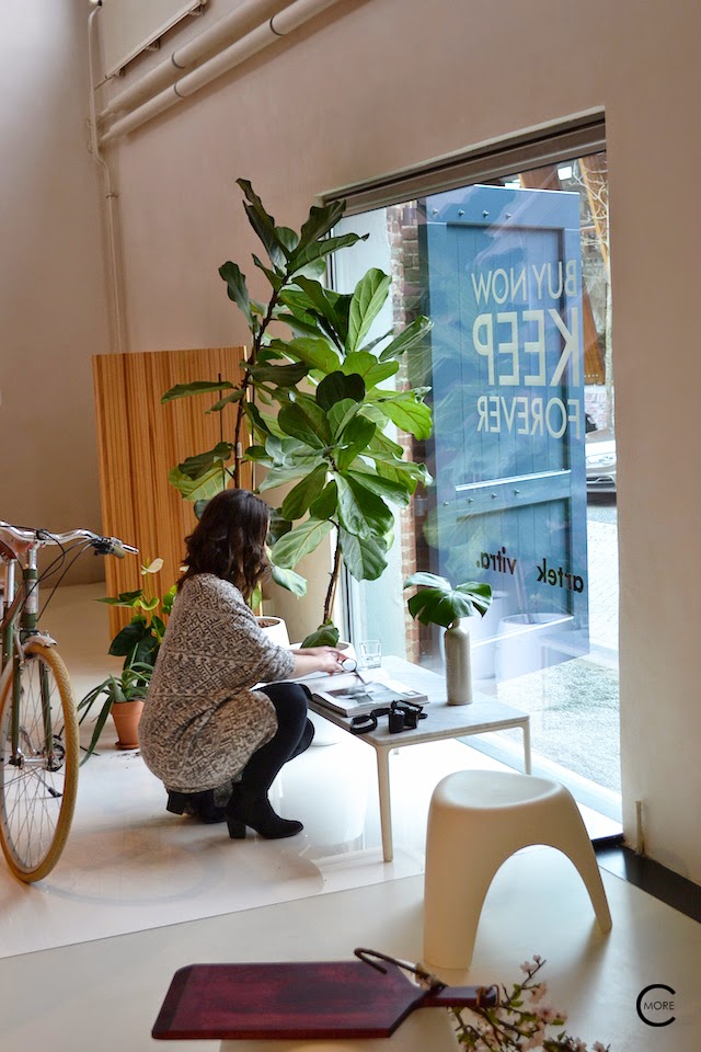
To be in this inspirational building, where Vitra showcase their Design furniture by “big name” designers like Ray and Charles Eames, Alexander Girard, Hella Jongerius, Ronan & Erwan Bouroullec was a real pleasure.
It’s no secret I’m a big fan of Vitra. As an interior designer I advise these design a lot. And why? Because they blend in so well. I love the vision of ” Collage Living”.
And besides that, a piece of design with the Vitra sign on it, is always a good investment. Throughout the years the design items have proved themselves as Design Classics.
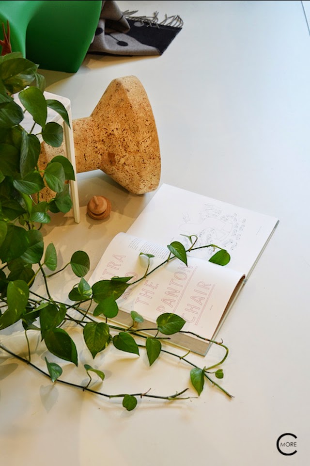
Like the panton chair by Verner Panton. After years of production development, the Panton chair was finally produced in 1967. But in 1970 they had to stop due to material failure. Time hasn’t stand still since then and nowadays the material development has made big progress and is the Panton Chair in full production. There even is a little panton chair for the kids and an outdoor version.
The chair itself is one of the most iconographic Design chairs, and used by many photographers.
Vitra | limited special color version “Summer Green” Panton Chair |
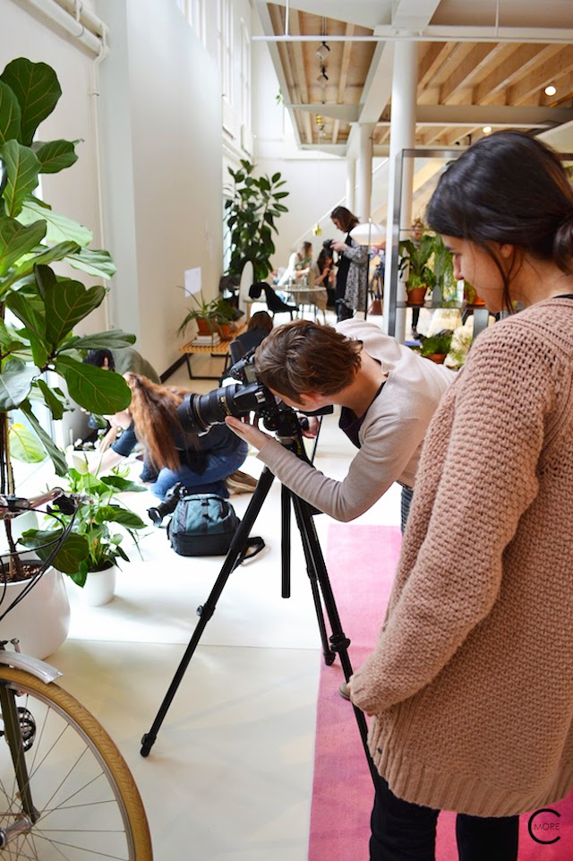
Meet the Blogger Masterclass photography and Styling | by C-More
Vitra has made a limited special color version: the “Summer Green” version. It’s available only until this summer. This green one blends in very well with other green shades and gives a joyful spirit to your interior or outdoors. Its available at some selected dealers. More info at VITRA
So, the students at the masterclass by Meet the Blogger were “spoiled” by so many good design items and such a great space to learn about Photograpy and Styling by two master teachers.
Nevertheless they had to work hard. They were split-up in little groups, and work together to make their own styled photo. From what I saw, they did very well!
If you like to see what the students made, you can find some of the work at Instagram#mtbvitra or simply search for #mtbvitra to find blogs writing about it.
.
The Panton Chair Limited edition in the color “summer green”
is available at selected dealers.
Enjoy!
For the Dutchies:
If you like to shop for the beautiful Vitra products and furniture:
Heerlijk om in dit inspirerende gebouw te zijn, waar Vitra hun design meubels van “grote namen” ontwerpers als Ray en Charles Eames, Alexander Girard, Hella Jongerius, Ronan & Erwan Bouroullec presenteert.
Het is geen geheim dat ik een grote fan van Vitra ben. Als interieurontwerper adviseer ik vaak deze ontwerpen. En waarom? Omdat ze zo goed passen in vele stijlen en sferen.
Ik houd van de visie van “Collage Wonen”.
En naast dat, een meubelstuk met het echte Vitra logo er op is altijd een goede investering.
Door de jaren hebben de Design items zich wel bewezen als Design Klassiekers.
Net als de Panton Chair van Verner Panton. Na jaren van productie en materiaal ontwikkeling werd de Panton stoel eindelijk geproduceerd in 1967. Maar in 1970 moesten ze stoppen door problemen met het materiaal: het brak. De tijd heeft niet stil gestaan sindsdien en tegenwoordig heeft de materiaal ontwikkeling grote vooruitgang geboekt en is de Panton Chair in volle productie.
Er is zelfs een mini Panton Chair voor kinderen en een outdoor versie.
De stoel zelf is een van de meest iconografische Design stoelen en door vele fotografen gefotografeerd.
Vitra heeft in beperkte oplage een speciale kleur versie gemaakt: De “Summer Green” versie. Deze is beschikbaar tot deze zomer. Het groen combineert heel goed met andere groen tinten en geeft een vrolijke noot aan het interieur of buiten in de tuin. Deze special is verkrijgbaar bij een aantal geselecteerde dealers.
Dus, de studenten werden tijdens de masterclass van Meet the Blogger super “verwend” door zoveel mooie Design items en de fantastische ruimte om van alles te leren over fotografie en styling van de twee top docenten.
Toch moesten ze hard werken.
Ze werden opgedeeld in kleine groepen om samen te werken
Last week I joined the Xmas event at Piet Boon Studio. It’s always a pleasure to visit their showroom. Is so calming and of a very high quality. The showroom was styled with beautiful designs, made out of nice textured materials in ton-sur-ton colors. This year the studio shows a bit more of it’s feminine side: round forms, soft colors and lot’s of textile, but still in the recognizable Piet Boon Style.
Also the Piet Boon Kitchen showroom was opened and styled for Christmas. A few tables were set, inspired by the Old Dutch Masters and Golden Ages. I loved it! Unfortunately, I didn’t bring my camera, so I only can show you these snapshots made with my Iphone. But still I thought these are worth sharing with you.
Beautiful table styling at Piet Boon Studio Kitchens
Beautiful white table styling at Piet Boon Studio Kitchens
Beautiful sofa at Piet Boon Studio
XMAS in green at Piet Boon Studio
Kerst
bij
PIET BOON STUDIO
Vorige week was ik bij het kerst event bij Piet Boon Studio. Het is altijd een genot om hun showroom te bezoeken. Zo rustgevend en van een zeer hoge kwaliteit. De showroom is ingericht met prachtige ontwerpen, gemaakt van fijne materialen in mooie texturen en in ton-sur-ton kleuren. Dit jaar laat de studio een beetje meer van zijn vrouwelijke kant zien: rondere vormen, zachte kleuren en veel textiel, maar nog steeds in de herkenbare Piet Boon Stijl.
Ook de Piet Boon keuken showroom was geopend en gestyled voor Kerstmis. Er stonden een aantal gedekte tafels, geïnspireerd door de oude Dutch Masters en de Gouden Eeuw. Ik vond het geweldig! Helaas had ik niet mijn camera bij me, dus ik kan alleen deze “snapshots’ laten zien, met mijn Iphone. Maar ik vond ze toch de moeite waard ze te delen met jullie.
This website uses cookies to improve your experience. We'll assume you're ok with this, but you can opt-out if you wish.AcceptRead More
Privacy & Cookies Policy
Privacy Overview
This website uses cookies to improve your experience while you navigate through the website. Out of these, the cookies that are categorized as necessary are stored on your browser as they are essential for the working of basic functionalities of the website. We also use third-party cookies that help us analyze and understand how you use this website. These cookies will be stored in your browser only with your consent. You also have the option to opt-out of these cookies. But opting out of some of these cookies may affect your browsing experience.
Necessary cookies are absolutely essential for the website to function properly. This category only includes cookies that ensures basic functionalities and security features of the website. These cookies do not store any personal information.
Any cookies that may not be particularly necessary for the website to function and is used specifically to collect user personal data via analytics, ads, other embedded contents are termed as non-necessary cookies. It is mandatory to procure user consent prior to running these cookies on your website.