Hi!
A while ago I moved my blog from Blogger to WordPress. And since I’m blogging from 2007, there are a lot of blogposts to check… So if you see a blogpost that’s missing photo’s or has a weird layout, please let me know by leaving a comment at that particular blogpost. In the meantime I’m walking through all my posts myself too.
I hope you like my new layout! Thanks for visiting.
See you around!
XO Iris
Hi!
Ik heb mijn blog van Blogger naar WordPress verhuisd! En aangezien ik sinds 2007 blog, zijn er een heleboel blogposts te controleren … Dus: zie je een blogpost waarbij foto’s ontbreken of die een rare lay-out heeft, laat het me weten dmv het plaatsen van een reactie op die blogpost. In de tussentijd loop ik al mijn berichten zelf ook nog na.
Ik hoop dat mijn nieuwe layout bevalt!
Bedankt voor je bezoekje, zie je later!
XO Iris
The use of images and text from this blog.
The use of images and text from this blog.
Want to use a post, photos or text of my blog? Great! Please always mention my full blog name and a correct link to the origin of the article on my blog on: your blog, pinterest boards, instagram, tumbler, your site or wherever you want to use my content. And... Please give me a note if you have it published!
Also make sure that all the images have the original source / photographer named. For pictures that are not mine, please contact the owner by yourself to ask permission...
As for the posts on my blog: I try my best to mention all the names and links correct and ask permission in advance. If you spot an item here on my blog that belongs to you and I do not have the accurate information, please contact me, I'll adjust it asap.
Thank you! XO Iris | C-More
Gebruik van beeldmateriaal en tekst van deze blog.
Wil je een post, foto's of teksten van mijn blog gebruiken? Leuk! Plaats dan in ieder geval mijn blognaam en een link naar de oorsprong van het betreffende artikel op mijn blog op: jouw blog, pinterest boards, instagram, tumbler, je website of waar je het ook publiceert. Geef je mij een berichtje als je het geplaatsthebt?
Zorg ook dat bij alle afbeeldingen de originele bron / fotograaf komt te staan.
Wat betreft de posts op mijn blog: ik doe mijn best alle namen en linkjes goed te vermelden. Mocht je iets tegenkomen wat jou toebehoort en ik er geen juiste informatie bij hebben staan, neem dan contact met me op, dan pas ik het direct aan.
DDW16 | Material and color | Bubblegraphy | Adrianus Kundert + Tomas van der Sman
If you follow me on Instagram, you probably have noticed I’m at the Dutch Design Week, for my yearly doses of Design and Trend input. The Dutch Design Week, also known as DDW, is such a unique event.
I think you can compare it best with the outside events of the Milan design week, like Ventura Lambrate. Lot’s of young, new designers, but also students and innovative brands are represented. There is so much to see, that you easily can stay the whole week and even then you probably missed some spots.
For me this year a few things were most outstanding: Lot’s of color and material research! One of the biggest examples of this is the exhibition ” Everything but the product” by Envisions, a group of last years graduated students of the Eindhoven Design Academy, who showcased their products and designs for the first time in Milan last April.
Below a selection of my finds until now. If you have the chance to go visit the Dutch Design Week for yourself: please do! You don’t want to miss this. Besides the uniqueness of this yearly event, with a never-ending input of design, you probably will be surprised by the warm and welcome feeling of the overall event, with all the designers who are willing to talk to you in person and explain their visions and concepts. But also the nice spots to eat and drink and relax are amazing.
DDW16 | Material and color | Christien Meindertsma
DDW16 | Material and color | Dutch Invertuals
DDW16 | Material and color | Dutch Invertuals
DDW16 | Material and color | Reflecting Holons | Martens en Visser
DDW16 | Material and color | unknown ( please fill me in!)
DDW16 | Material and color | Sabine Marcelis
DDW16 | Material and color | Social Design
DDW16 | Material and color | Bubblegraphy | Adrianus Kundert + Tomas van der Sman
DDW16 | Material and color | Willeke Machiels + Nadia ten Wolde
DDW16 | Material and color | Rens
DDW16 | Material and color | Sanne Schuurman
DDW16 | Material and color | Cox Janssens
DDW16 | Material and color | Light of Colour | Nai-Dan Chang
DDW16 | Material and color
DDW16 | Material and color | Diana Scherer
DDW16 | Material and color | Living Colours Buro Belen
DDW16 | Material and color | Adrianus Kundert | Riping Rugs
DDW16 | Material and color
DDW16 | Material and color
DDW16 | Material and color | RembrandtLAB
DDW16 | Material and color | Indigo | Crafts Council Nederland | Adrianus Kundert
DDW16 | Material and color | Glenn Mosterd
DDW16 | Material and color | Sanne Hendriks
DDW16 | Material and color | Atelier NL
DDW16 | Material and color | Van Abbe museum | Aristotle’s room
DDW16 | Material and color | Envisions
DDW16 | Material and color | Envisions
Dutch Design Week 2016
Als je me volgt op Instagram, heb je waarschijnlijk al gemerkt dat ik deze week bij de Nederlandse Design Week ben, voor mijn jaarlijkse doses Design en Trend inspiratie. De Dutch Design Week, ook wel bekend als DDW, is zo’n uniek evenement.
Ik denk dat je het het best kunt vergelijken met Ventura Lambrate in Milaan tijdens de Designweek. Veel jonge, nieuwe ontwerpers maar ook studenten en innovatieve merken zijn vertegenwoordigd. Er is zoveel te zien, dat je makkelijk de hele week kunt blijven en zelfs dan waarschijnlijk nog niet alles hebt gezien.
Voor mij is dit jaar het meest opvallend: Heel veel kleur en materiaal onderzoek! Een van de grootste voorbeelden hiervan is de tentoonstelling “Alles behalve het product” van Envisions , een groep vorig jaar afgestudeerde studenten van de Design Academy Eindhoven, die hun producten en ontwerpen voor het eerst in Milaan hebben tentoongesteld, afgelopen april.
Hieronder vind je een selectie van mijn vondsten tot nu toe. Als je de kans hebt om zelf de DDW te gaan bezoeken: doen! Je wilt dit niet missen. Naast het unieke karakter van dit jaarlijks evenement, met een enrome hoeveelheid design, zul je waarschijnlijk verrast zijn door het warme en gastvrije gevoel van het totale evenement, waar alle ontwerpers bereid zijn om je persoonlijk te woord te staan en hun visies en concepten uit te leggen. Maar ook al die leuke plekjes om wat te eten en te drinken en te ontspannen zijn fantastisch.
Esmay Gunter, International Lifestyle Studies Student at Fontys in Tilburg with subject of study trend watching and concept, visited the Dutch Design Week in Eindhoven together with me. In the line of her study, she wrote a trend report in the form of a blog post. Very interesting to read her findings!
Enjoy!
Dutch Design Week & Trends by Esmay Gunter
Just like any other year, the Dutch Design Week took place at Eindhoven from October 7 till October 28. Being an International Lifestyle student, I went to the fair searching for signals and trends that stood out in the world of design.
DDW15 Trend – Let It Be – | “Cosmetic Surgery” by Bora Hong | “Gewildgroei” by Benny Meek | Table by Yolanda Heintze | Pictures by Esmay Gunter
– Let It Be –
The first trend I spotted was the opposite of what the beauty standard is today. these days, everything has to be perfect and everything your body does naturally is being pushed back to maintain this image of perfection. The opposite reaction on this beauty standard shows us that we don’t need to hunt for perfection and just let our body go his way.
A perfect example is cosmetic surgery, something that becomes more and more the standard for people these days.
Designer Bora Hong questions the meaning of beauty and design trends by comparing them with the development in the design branch. Just like a cosmetic surgeon, Bora Hong transforms old second-hand chairs in to iconic design masterpieces, such as the LCW chair of Eames. by doing so she tries to show people that changing someone’s body, or in this case, a chair goes against the way you really are.
Another signal that follows this trend is ’’Gewildgroei’’, a project by Benny Meek. Instead of working against nature, he wants to work together with nature. He thinks that this is something crucial that has to change in the way we look at ourselves. weeds are seen as something unwanted. That’s why Benny Meek designed a tile where ”Gewildgroei”, the counterpart of weeds, are allowed to grow as they like. This way nature can go her way without being stopped. This also creates more real nature in cities which helps adding to a healthy environment.
Yolanda Heintze has designed a table in which this trend has been taken very literally. Nature grows right thru the table, making it look like nature was just left there like it was.
——————–
DDW15 Trend – Fit in – | “Current Window” by Marjan van Aubel | 3D Printed canal house by DUS architects | lamp ” ZUID” by Francoise Oostwegel | Pictures by Esmay Gunter
– Fit in –
Due to recent demographic changes and technological advancement it sometimes seems that cultures slowly fade away. But something like culture is really important, it is part of someone’s identity. I spotted multiple signals that try to maintain culture, but at the same time trying to fit this culture in to modern day designs. This creates new ways to implement your own culture.
An example of this signal is “Current Window” by Marjan van Aubel. It is a modern day version of stained glass windows created with modern day instruments. The colored glass extracts electricity out of daylight which can be used to power your electronic devices inside your house. This way you can even charge your phone whilst sitting next to your window by having it plugged in the implemented USB-ports in your window sills. This creates an old cultural aspect like stained glass, into something modern and innovative.
Another signal of this trend is the 3D Print Canal House, a 3D printed canal house located in Amsterdam-Noord. It is a project by DUS Architects and Partners. This makes for a whole new way of building the iconic canal houses by using the latest innovative technology, and still maintaining the cultural aspect of the houses.
Lamp ,ZUID’, designed by Francoise Oostwegel, is another signal that fits the trend. She used the cultural heritage of Limburg to design this creation, such as the mining area and the traditional craftsmanship houses. This makes ,ZUID’ not only a lamp, but it also tells the story of our most southern province.
——————–
DDW15 trend – Sense Intense – | Clock “O” by Wout Wolf Stroucken | “Solid Vibrations” by Ricky van Broekhoven and Olivier van Herpt | “Ripening Rugs” by Adrianus Kundert van Nieuwkoop | Pictures and trend report By Esmay Gunter
– Sense Intense –
Everything has to be quick these days. Every second counts and we barely have any time to stop and think about something or to think about things that have happened before. It creates a feeling of time just flying by. This creates a desire to intensify the present, and to relive certain memories to feel this intense feeling once more. I have spotted certain signals that go further than anything else before, and that try to give you an intense feeling.
Wout Wolf Stroucken designed a clock named “O”. The clock has no numbers, nor an indicator. The time is indicated by colors. Just like a tree’s growing rings, the clock shows the time using the rings that grow from the center of the clock towards the border. This makes people able to focus more on the now and here, rather than worrying about the future.
Another interesting design that plays with intensive feelings is “Solid Vibrations”. Ricky van Broekhoven and Olivier van Herpt build a 3D printer for ceramic designs. It allows them to interfere with the printing process by using vibrations caused by sounds. This makes it possible to transform music into something you can touch because it’s printed on something solid. It happens a lot that a certain song makes people remember certain things like a nice summer holiday. That specific song can now be transformed into something solid, something that you can actually hold and touch. This makes the memory more intense because not only can you hear the song, now you can even touch it.
And last, Adrianus Kundert van Nieuwkoop designed “Ripening Rugs”. These are carpets that show a positive effect when they are used much. The carpets actually ‘come to life’ when they are used intensively. They change color, patron or even texture.
Trends gespot
tijdens de
Dutch Design Week | DDW15
door Esmay Gunter
Esmay Gunter, Student International Lifestyle Studies op het Fontys in Tilburg, met als richting trendwatching en conceptontwikkeling heeft samen met mij de Dutch Design Week in Eindhoven bezocht. In het kader van haar studie heeft zij een trendreport in de vorm van een blogpost gemaakt. Zeer interessant om haar bevindingen te lezen.
Geniet!
——————–
Dutch Design Week & Trends door Esmay Gunter.
Ook dit jaar vond de Dutch Design Week plaats in Eindhoven, van 17 t/m 25 oktober. Als International Lifestyle Student ging ik naar de beurs op zoek naar opvallende signalen en trends in de wereld van design.
——————–
– Let It Be –
De eerste trend die ik gespot heb is een tegenreactie op ons schoonheidsideaal. Tegenwoordig moet alles maar perfect zijn en worden natuurlijke omstandigheden of veranderingen tegengegaan. De tegenreactie hierop laat zien dat we juist niet moeten streven naar perfectie en de natuur niet moeten tegenwerken.
Een voorbeeld hiervan is bijvoorbeeld de cosmetische chirurgie, wat vandaag de dag steeds normaler lijkt te worden.
Designer Bora Hong bevraagt de betekenis van schoonheids- en design-trends door cosmetische chirurgie te vergelijken met ontwikkelingen in het designveld. Als een plastisch chirurg bouwt Bora Hong tweedehands stoelen om naar iconische ontwerpen, zoals de LCW stoel van Eames. Op deze manier laat ze zien hoe het aanpassen van iemands lichaam, of in dit geval een stoel, zijn eigenheid ondermijnt.
Een ander signaal wat bij deze trend aansluit is het project „Gewildgroei” van Bennie Meek. Hij wil niet meer tegen de natuur inwerken maar juist met de natuur meewerken, iets wat volgens hem een noodzakelijke omslag moet zijn in ons denken. Onkruid wordt gezien als iets ongewenst. Bennie Meek heeft daarom een stoeptegel ontworpen waar gewildgroei (de tegenhanger van onkruid) door de nieuw vormgegeven tegels mag groeien. Op deze manier kan de natuur toch zijn gang gaan, zonder dat het wordt tegengehouden. Het brengt bovendien meer échte natuur in een stad, wat bijdraagt aan een gezondere leefomgeving.
Yolanda Heintze ontwierp een tafel waarin deze trend letterlijk in opgenomen is. Het groen groeit door het meubelstuk heen, waardoor het lijkt alsof de natuur is gelaten zoals het is.
——————–
– Fit In –
Door demografische veranderingen en technologische vooruitgang lijken culturen soms te vervagen. Toch is cultuur heel belangrijk, het is een gedeelte van iemands identiteit. Ik heb signalen gespot die inspelen op het behouden van een eigen cultuur, maar juist wel die passen in de tijd van nu. Er ontstaan dus nieuwe manieren om de eigen cultuur opnieuw te implementeren.
Een voorbeeld hierbij is “Current Window” van Marjan van Aubel. Het is een moderne variant op een glas-in-lood raam, gemaakt met hedendaagse technologie. Het gekleurde glas wekt namelijk elektriciteit op uit daglicht, wat gebruikt kan worden voor elektrische apparaten in huis. Zo kan je ook je telefoon opladen bij het raam, doordat er USB poorten in de vensterbank verwerkt zijn. Op deze manier wordt een cultureel aspect van vroeger in een nieuw jasje gestoken en is het juist een innovatief object geworden
Een ander signaal bij deze trend is de 3D Print Canal House, een 3D geprint grachtenpand in Amsterdam-Noord. Het is een project van DUS Architects en partners. Door het gebruik van deze innovatieve technieken kunnen de typisch Amsterdamse grachtenpanden op een nieuwe manier worden gebouwd, zonder dat de cultuur verloren gaat.
Ook is Lamp ‚ZUID’, ontworpen door Francoise Oostwegel een signaal die bij deze trend past. Ze heeft zich bij dit ontwerp namelijk laten inspireren door cultureel erfgoed in Limburg. Onder andere door de traditionele vakwerk huisjes en het mijnengebied in Limburg. Op deze manier is ZUID dus niet alleen een lamp, maar verteld het een verhaal over de meest zuidelijke provincie van Nederland.
——————–
– Sense Intense –
In de tegenwoordige digitale wereld telt iedere seconde en hebben we bijna geen tijd meer om écht bij dingen stil te staan of aan momenten terug te denken. Er bestaat een gevoel dat alles maar aan ons voorbij vliegt. Hierdoor ontstaat een behoefte naar het intensiveren van het hier en nu en het herleven van bepaalde momenten, zodat dat intensieve gevoel ook weer herbeleefd kan worden. Ik heb signalen kunnen spotten die verder gaan dan anders en inspelen op een intensief gevoel.
Zo heeft Wout Wolf Stroucken een klok genaamd „O” ontworpen, zonder cijfers en wijzers. De tijd wordt weergegeven aan de hand van kleuren. Net als de groeiringen van een boom, toont de klok de tijd in de ringen die groeien vanuit het midden naar buiten toe. Op deze manier kan men meer focussen op het hier en nu, zonder te veel bezig te hoeven zijn met de toekomst.
Een ander interessant signaal dat inspeelt op het intensiveren van momenten is Solid Vibration. Ricky van Broekhoven en Olivier van Herpt bouwden een 3D printer voor keramiek. Hierbij kunnen ze door middel van geluidstrillingen het printproces beïnvloeden. Muziek kan hierdoor tastbaar gemaakt worden doordat er een materiële belichaming van geluid gevormd kan worden. Vaak doet een bepaald nummer mensen terugdenken aan bijvoorbeeld die ene vakantie. Dat moment kan nu intenser gevoeld worden door niet alleen te luisteren maar ook het daarbij behorende object te kunnen voelen.
Ten slotte heeft Adrianus Kundert van Nieuwkoop „Ripening Rugs” ontworpen. Dit zijn vloerkleden die een positieve effect geven door intensief gebruik. De tapijten komen bij intensief gebruik als het ware tot leven en veranderen in een andere kleur, textuur of nieuw patroon.
DDW15 Dutch Design Week 2015 collage by C-More interior blog | L-R | Rossana Orlandi + Martil Laforet | Design academy > Bottle Up | Klokgebouw > Tokihero Sato at Piet Hein Eek > NLXL + Piet Hein Eek marble wallpaper > Ontwerpduo at Piet Hein Eek > Brass vase by Piet Hein Eek
DDW15 Dutch Design Week 2015 collage by C-More interior blog | L-R | Pieke Bergmans at The Kazerne > Sanne Schuurman at The Design Academy > Lidewij Edelkoort expo at The Kazerne > Nel Verbeke at the Design Academy > Daniela Trelja at The Design Academy > Bori Kovacs at the Design Academy
Vergeet niet de Dutch Design Week 2015 te bezoeken deze week! Ben je niet in de gelegenheid te gaan, of vind je het leuk te zien wat ik allemaal gespot heb? Volg me dan op C-More Instagram of C-More Facebook voor de updates.
Since Iris is out of town this week I, Janneke van de Haterd have the honor
of sharing one of my favorite events with you.
I love the Dutch Design Week and especially the graduation show.
I’ve been going to them for the last ten years and always get so inspired!
Especially by meeting the (young) designers and getting to share and feel their enthusiasm.
This year; as always, there was so much to see and so much diversity in subjects and design.
Some design shown are just gorgeous or smart on the first sight,
for some you need to read the text or talk to the designer to understand the great ideas.
I have picked a few of my favorites to share with you;
I have chosen some designs that were gorgeous
(as well as many other things)
hope you’ll enjoy!
Ambio Teresa van Dongen
Ambio Teresa van Dongen
Bacteria & light
I really loved the light of Teresa van Dongen. This light operates on artificial seawater with bioluminescent micro organisms that give light as it comes in contact with oxygen. So when you give the lamp a gentle push it shows a beautiful blue light that gave me a fairytale-feeling.
————-
mood of music van Joris Petterson
mood of music van Joris Petterson
foto: Janneke van de Haterd
Combining music, light & scent
According to Joris music is more then just sound. Music is an experience. The beautiful transparent gramophone speaker not nobly shows the beat of the music; is produces light, couloir and scent in the style of the selected tunes. Just imagine your coffee-time tunes with the smell of fresh brewed coffee and warm comforting lights…
————-
Desiree Wevers
Desiree Wevers by Janneke van de Haterd
Desiree Wevers by Janneke van de Haterd
Desiree Wevers by Janneke van de Haterd
Desiree Wevers by Janneke van de Haterd
Desiree Wevers by Janneke van de Haterd
I loved the projects of Desiree Wevers. She combined a social project with old crafts and with beautiful screens as a result. For this project (Knot) she teamed up with a group of Turkish ladies after she heard about isolation of immigrants. She learned all about their old crafts and their knowledge and developed new design and new innovative applications for this craftwork.
————-
Aai-en
Anke Verstappen
aai-en
foto: Janneke van de Haterd
ankeverstappen.com
Aai-en
Perhaps you have seen this before; but i just could not leave it out :-). Anke Verstappen developed a special playing mat for children that were born blind. These children often fall behind in their development in their first few years and this mat helps them to stimulate their senses, and looks beautiful as a nice bonus.
Pieteke Korte (http://www.ptkkrt.nl/) has developed a series of tables that play with the relationship between hard and soft materials. under the wight of the marble tabletops the foam bases take on cartoonesk shapes.
————-
oti- dark matter collection
oti- dark matter collection Joel Booy
foto Janneke van de Haterd
oti- dark matter collection Joel Booy
foto Janneke van de Haterd
oti- dark matter collection
Joel Booy developed a lamp inspired in a network of caved lines and crystal growth. All circles with separately so you choose how many are turned on (or off). Just a beautiful lamp. Check out there sight for more. http://www.studiotrulytruly.com/
Vhateau d’Eau
Ofcourse there is also still attention for awareness. The quality of our tap water is really good and thousand times less expensive (as well as beter for our environment). Maud van Deursen made 4 carafes that help us to be aware of how special tap water is. The shapes of the carafes reflect dutch water towers and emphasize the flow of water in a different way. http://www.maud-design.nl
————-
I would love to show you all 155 projects, but that would be a bit much :-) After seeing the whole graduation show i noticed some subjects (or trends) that kept coming back and wanted to share a preview of it.
If you want to see more and if you don’t have any plans yet this weekend; please go to Eindhoven and visit the „ Witte Dame”! More info & http://www.ddw.nl/
This guestpost is written by Janneke van de Haterd
This fair is highly recommended if you love design,
so if you have not yet made plans:
You still have a chance to go this week!!
It’s from 18 until 26 October 2014
The DDW14 is so big that you never can see it completely in one day:
you have to make choices, or maybe go several days.
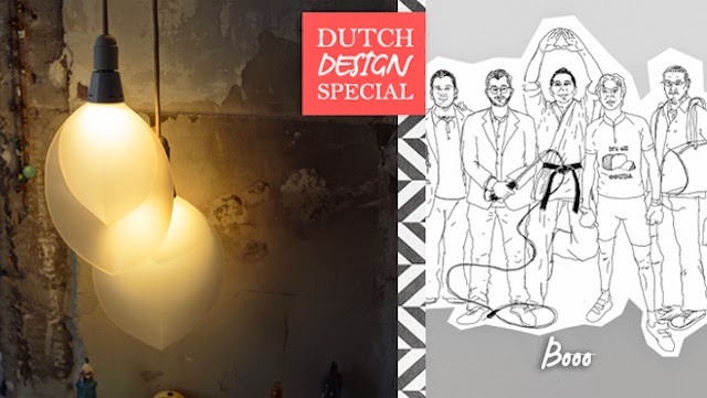
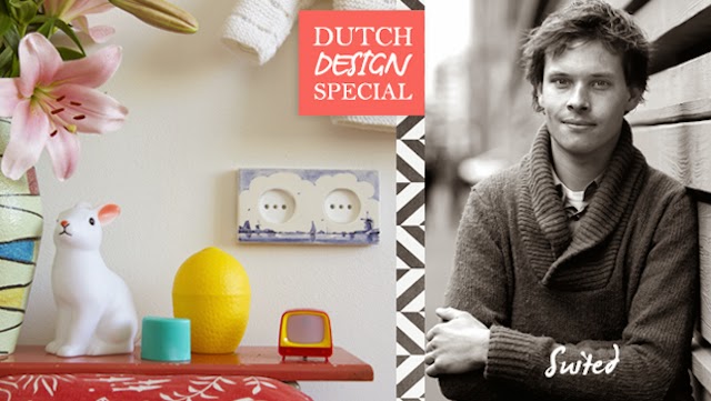
Fortunately, Westwing invited seven special Dutch designers for an interview, Dirk van der Kooij with his 3D printed furniture, FLINK with the hip knits for the home, Elke van den Berg [I am a big fan of her!] with beautiful porcelain, gems jewellery by Petra Reijrink, affordable bulbs of BOOO, storage options Strackk and tiles to conceal your socket by Suit’d®.
Het is een echte aanrader als je van Design houdt,
dus mocht je nog geen plannen gemaakt hebben: Doe dit dan alsnog!
De DDW14 is zo groot dat je het nooit in één dag helemaal kunt gaan zien,
dan moet je keuzes maken, of toch meerdere dagen gaan.
De DDW is van 18-26 oktober 2014.
Gelukkig heeft Westwing zeven bijzondere Nederlandse ontwerpers uitgenodigd voor een interview, Dirk van der Kooij met zijn 3D geprint meubilair, FLINK met de hippe breisels voor in huis, Elke van den Berg [ ben ik groot fan van!]prachtig porselein, juweeltjes van sieraden van Petra Reijrink, betaalbare bulbs van BOOO, strakke opbergmogelijkheden van Strackk en tegels om je stopcontact te verhullen van Suit’d®.
Westwing loves Dutch Design en viert dat deze week mee door elke dag een andere Nederlandse ontwerper niet alleen een podium, maar ook eigen shop te bieden.
De ‘Westwing loves Dutch Design’ week begint op zondag 19 oktober op www.westwing.nl.
Daarnaast brengt het online magazine een kijkje in het creatieve brein en de keuken van de ontwerpers. Elke dag zal er een Dutch Designer in de schijnwerpers staan, met als unicum dat je meteen door kunt gaan naar de shop van je keuze om de producten aan te schaffen.
Kijk op de site van Westwing voor de DDW designer interviews,
de Dutch Designer shops én voor de fantastische design aanbiedingen
This website uses cookies to improve your experience. We'll assume you're ok with this, but you can opt-out if you wish.AcceptRead More
Privacy & Cookies Policy
Privacy Overview
This website uses cookies to improve your experience while you navigate through the website. Out of these, the cookies that are categorized as necessary are stored on your browser as they are essential for the working of basic functionalities of the website. We also use third-party cookies that help us analyze and understand how you use this website. These cookies will be stored in your browser only with your consent. You also have the option to opt-out of these cookies. But opting out of some of these cookies may affect your browsing experience.
Necessary cookies are absolutely essential for the website to function properly. This category only includes cookies that ensures basic functionalities and security features of the website. These cookies do not store any personal information.
Any cookies that may not be particularly necessary for the website to function and is used specifically to collect user personal data via analytics, ads, other embedded contents are termed as non-necessary cookies. It is mandatory to procure user consent prior to running these cookies on your website.